Friday 14 June 2013

Evaluation

For this project I gave myself the task to produce a series of fashion illustration  based on the inspirations I found in Athens. I decided to do fashion illustration because it fits well with my chosen course, Fashion Promotion, and also because I have not explored illustration before. While doing this process I would like to improve my drawing and MAC skills. Another reason I decided to do illustration was that drawing and surface patterns are my strongest areas. 
While visiting Athens I was inspired by the bold, dynamic graffiti that was plastered all over the walls. This inspired me because it was so unique and quirky and the graffiti looked like art work. As I found the graffiti so inspiring I decided to create a project that would incorporate fashion and graffiti. The idea of this works well because it is controversial and uncommon. Fashion design is not my area as I'm not interested in sewing so I decided to create illustrations because I have strong observation skills 
In this project I have used a number of different formal elements. I have used line to show the flow of movement with in my illustrations. I created this element using a biro pen because it highlights shapes and gives the illustrations free form. Another formal element I have used is colour. I used colour to create dynamic, loud illustrations so they are vibrant and exciting. I used watercolours to show this element because not only can you get bold colour but you can create tone usin this material. Using watercolour shows the contrast between light and shadow giving the illustrations a 3 dimensional depth. The main element I have used is composition. Using composition helped me to place different areas of the illustration which helped with my decision making. The composition of my illustrations were unbalanced so one side was heavier than the other. With the heavier side being dominant we are drawn to that area. 
Through out this project I think my strengths has been my artist research. As I looked at a variety of different fashion illustrators I hade a wide range to experiment with.  This helped with my decision making and the choice of the materials I was going to use. When first creating my final illustrations A problem occurred where they were too flat and busy. I overcame this problem by taking back a few steps and looking at my research. By doing that I rethought about the composition and the components going to be used. After doing that I came up with successful, crisp outcomes.
My strength here was my detirmination as I wanted to have a successful show. Even though I have annotated everything I think this area is the biggest weakness because I don't believe that I have annotated it thoroughly enough. From this I have learnt that annotation is equally important as the practical work so in future I am going to spend more time on the theoretical side. Setting up the exhibition and preparing for it went well because I had my illustrations create and printed in time so I had my work up quickly. 
From this project I have learnt that artist research is extremely important because it is the grounding of your projects and inspires your ideas. I have also learnt that experimenting with a wide variety of materials is helpful because you have a wide range of choice to develop from. While creating my illustrations my MAC based skills have improved a lot because I now know a broad range of techniques that I can use in the future. Another skill I have learnt is how to set up an exhibition. I believe that this went well because everyone worked as a team and had eachothers opinions to develop from. 
Overall I think my project has gone well because I have a strong body of research and development. I think it has gone well because I have problem solved to create successful and professional outcomes. I believe that my exhibition display was successful because it shows a development process on the boards so the public can understand where I got my ideas from. If I was going to do this project again I would think more into the model layer of my piece and play around with poses so I could have a more unique outcome. I would also use more pattern to create texture and give it depth. To develop from what I have produced I would play around with brighter colour palettes, textured patterns  and compositions. I am pleased with what I have produced for my FMP because Inhave kept developing further throughout this project. Even though I am happy with my exhibition and outcomes I would like to push my illustrations further because I believe they can be experimented with more. 
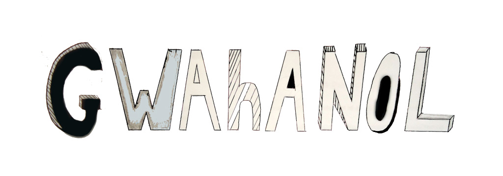
Thursday 13 June 2013

FMP-Greek Layering Graffiti Sheet

From researching Raphael Vicenzi's fashion illustration I was inspired by the layering, textured effect present in his designs. I liked the idea of layering because they did not look like flat 2 dimensional drawings because the layering of each component gave it a 3 dimensional depth. His illustrations were busy and loud because text and imagery were randomly placed making them unbalanced and quirky. As the idea of layering inspired me I decided to experiment with it on tracing paper to play around with composition and materials. 
The materials I used were pro-marker pen, biro and pencil. Using the pro-marker pen created a pop of colour on the page which draws us in, creating excitement. The biro pen highlights certain areas making them dominant. Also using a biro shows successful flows of movement the marks create as it has free form. Using the pencil created tone which shows the contrast between light and shadow giving the shapes a 3 dimensional depth. 
The layering effect on this sheet gives it an element of abstraction because it is representational. The use of tracing paper fades the text and makes it indefinite. The busy text is randomly ordered making it loud as there is a lot going on. Using tracing paper has also blending the text together creating textured depth.
I think this sheet has worked well because it shows an effective depth into layering and also plays around with different combinations of materials. The idea of layering is successful because this process can also be created using the MAC computers with the layered tool on Photoshop. By creating layers on the MAC I can easily play around with composition and remove stuff I do not want. For further development I am going to using this layering process in different media such as clay and graphics. I am going to do this to see which media is the most crisp and clean for my final outcomes. 

FMP- Raphael Vicenzi Critique


'You'll never be rich and famous' gives off the idea of putting someone down' as if they are not good enough or talented enough to be known or at the top. This statement brings you back to reality in an abrupt way by using the word 'never'. By using this word it makes it seem as if it is impossible and will not ever happen so you should just accept it. In the illustration it also says 'Forget about it', which supports the idea of it never happening. ' Forget about it' is used to say that there is no point in even thinking about it. It ruins the idea of dreams. Also these words used are abrupt and have a harsh manner to them. It is almost as if someone is talking down to you. The text used is American casual talk. It has a layer back impression as if it is not important. 
First glance the words 'Rich and Famous' stand out because thy are bold and striking because they are thick and blocky. Without reading the rest of the text we would not understand what the illustration is actually about. Therefore this makes the illustration misleading.
In the illustration bright, vibrant colours are bursting off the page which gives it an element of excitement. This could perceive the colourful experience of being famous and how busy the lifestyle is. Using these colours also make it misleading because we think of bright colours being happy, whereas this illustration is downgrading someone. 
Excitement is portrayed by the busy composition and the use of different materials. As the words and shapes are randomly placed this is still some sort of sophisticated order. This creates flowing lines to show movement. 
The text and imagery have been juxtaposed together to create layering. From this layering effect texture is created as certain areas overlap creating depth. Without each layer this illustration the composition would not be correct because it would unbalance everything. If we took away the small text the idea of this illustration could be dreams or celebrities. As the small typography is added it changed the whole mood of the illustration by making it abrupt and downgrading. The first layer of this illustration is the girl. We know this because every other component has been overlapped onto her. From her strong structured pose we immediately think that she is a model. We are questioned whether she is an actual model or acting as a model. The order of the layering could be the journey of her career in the model industry. The small typography could show the criticism she has had off people and by being the first layer it is almost as if she is trying to hide away. 
I like the idea of this illustration showing a journey of someones career because it gives it a narrative and shows development. From this illustration I am going to develop the idea of layering and experiment with different medias to see which combinations and compositions work best. Firstly I plan on using tracing paper to create designs onto then layering that over each other. This will also help me experiment with opacity. 

FMP Research- Andy Warhol


Likewise to Andy Warhol's prints mine dehumanising the person as it is not actually them, it is a print of them. This question the idea of how you see the print. In comparison the Andy Warhol's art mine has bright, bold colours which makes it dynamic and exciting. Also likewise to Andy Warhol's work there is a strong contrast between the hair and the background which draws us to the hair and makes it dominant. There is a pop of colour on the page which fits into the movement of 'Pop Art'. My work is also blocky and bold like Andy Warhol's which makes the print strong because of the powerful colour. 
In contrast to Andy Warhol's work I have created an outline of the person which highlights her and shows the movement in the shape and makers her stand out. In comparison I think Andy Warhol's is more successful as the edges are crisp because the colour is tightly compacted together. 
Likewise my illustration is balanced because there is a equal amount of colour and shape on each side. Andy Warhol's prints are close towards the face which make them dominant compared to the background. 
I don't think my outcome was very successful because it does not have the softness in the mark making that Andy Warhol has. If I had soft tones it would blend to create depth and make the piece look 3 dimensional. Even though Andy Warhol's work is dynamic and exhilarating I don't think I'll use his process for my illustration because they are too blocky and bold. If the bottom layer was bright and bold with colour is would become dominant and fade out all the other layers. To overcome this I could experiment with the opacity tool but I would prefer to have my bottom layer more subtle so it contrasts with the other layers. 

Wednesday 12 June 2013

FMP- Gabriel Moreno Research


Another illustrator I have researched I Gabriel Moreno. Gabriel Moreno blends illustration with print making to create intricate, detailed designs. His illustrations are organic as the lines are curvy and free form. The free movement of lines shows the sensual,delicate shapes flowing which liquefy the illustration . Gabriel Moreno's flowing work creates rainbow like shapes which burst with colour. In his work he uses layering with the lines to create tone. The tone is created by the patterned lines creating shadow and depth. This makes it look 3 dimensional. The mark making tangles and creates a mixture of different shapes and textures as they overlap. His designs are crisp and clean as the edges are overlapped and tightly compacted together. Even though there is freedom with in his mark making there is precision because there is formal order. He uses the human form so there had been a strong use of observation. Watercolour is present in some of his work because it draws is into certain areas and gives off a vibrant burst of excitement. His work is unbalanced which inclines us to draw our attention to certain areas. This makes certain areas of his work heavier and dominant. 
  Gabriel Moreno's work has inspired me to focus on the small details as well as the larger details to create a more crisp, professional outcome. Focusing on small details will work well for my illustration because I'm going to print them large scale, so by doing this you can see the delicate, intricate marks I produced . His work has inspire me to link different areas together through flow of movement within the lines. Also I like the idea of the illustration being unbalanced because it makes it loud and gives it formal order. 

Tuesday 11 June 2013

FMP- Sarah Moon Research

Sarah Moon's illustration are soft because there is no blocky, bold elements present. As is it soft it makes the illustration look delicate and subtle. The idea of it being subtle makes it less overpowering and calm. In her illustrations muddy colours are used which makes them look dull. If I was going to create an illustration using the same colour palette as Sarah Moon I would use tea staining because it would be successful as it wouldn't be bold and vibrant. The eyes in her work are dominant because they are bold and striking which draws us in. These piercing eyes have been created with tone which gives them a three dimensional depth and makes them realistic. The coloured behind the figure used for her illustrations is successful because it highlights the figure making it stand out from the background. 
I decided to look at Sarah Moon's illustrations because they are more subtle and calm compared to the other illustrators I have research. With Sarah Moon's work I think the most successful factor is her use of tone. The tone blends in the figure creating shadow and light, making it look life-like and gentle. Her work has inspired me to use lighter tones and gentler marks to create subtle layers.  I would develop her materials and methods by experimenting with chalk to have a free flowing composition because chalk is a material you don't have full control over. I'm going to use the subtleness of Sarah Moon's illustrations for my model layer because this effect will not fade any other layer and at the same time it is not dominant.  

FMP- Fourth Illustration

I created the first layer of the model on Illustrator. After doing that I realised that the model looked flat and traced like a cartoon. I overcame this problem by using colour to create tone which gave it depth and made the model look more realistic because her features were highlighted. Adding the colour also gave the grounded texture which I could experiment on top of. As the faded colours worked so well I added more to give the illustration grounding which created patterned textures. I added linear illustration of the Acropolis to show the flowing movement of the lines and also because it fits in with my theme of Athens. These illustrations contrast with the bold, large areas of colour. I adding shadow to the Acropolis drawings which highlighted them so they would not fade into the background as they are not as vibrant as the other components. The busy text is randomly ordered which gives it a child like playfulness yet sophistication as the marks have been put together to create a highly complexed layer. The striking shapes create distress because they are overlapped and tightly compacted together which creates a busy composition. The shapes and colours used in this piece give it an abstract element as they are representational and not definite objects.
Having my model large scale was not that successful because she looks to linear and traced ,so if I was going to relate this again I would draw her on a smaller scale so the lines are closely compacted together and she would not dominate the page. I think the mixture of different colours overlaid worked well because it creates a textured pattern and has a child like playfulness to it which makes it fun.
If I was going to develop this illustration further I would add more coloured tone to the model to make her look three dimensional and more realistic. I would also play around with different patterns and opacity levels to make this illustration more intriguing and have more depth.