Tuesday 23 October 2012

Small Book

This is a little book I created during a workshop.

Photography Print

This was my final outcome. I think that the brightness of the light works well because you can see the contrast with the darker areas. Also the darker areas show the detail.  This print didn't turn out quite right because it has a red tint to it. The cause of this would have been exposure to light. I think this print relates to John Blakemore's work because it has a floral element to it.

Contact Sheet for Photography

I created this contact sheet for tests and to show a range of different prints based on abstraction. The image I have highlighted is the one I have chosen to produce as a large print. I chose this print because it looks the most abstract and I can get an intense contrast with light and shadow.

Press Mould

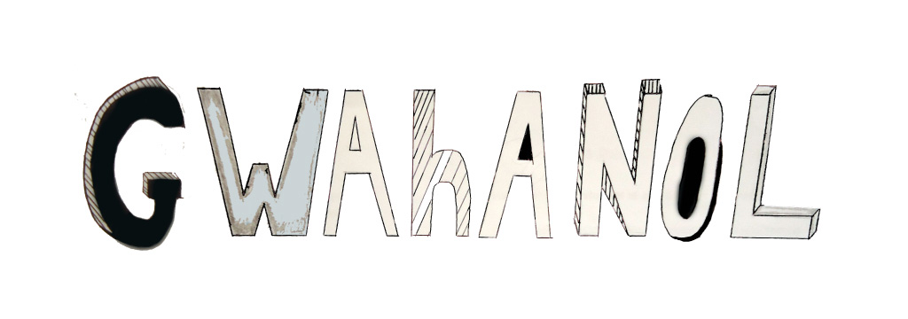
We were given the task to create a large press mould out of clay, in a group.
This was the result;
 
 
Due to this outcome being a success,I decided to create one for my final piece. I used this process because it was more successful than my slab building and I intend to glaze it was copper oxide to show the detail and enhance the texture.
 
 
In order to improve this piece I would file it down  to a more refined outcome.

Slab Building

I was given the task to create a composition using shapes on a magazine page.

Following on from the above task I transferred this composition onto a clay panel and carry out the slab building process.
The outcome wasn't successful because it was untidy and needed to be refined.
If I created this again I would apply the composition more firmly as it faded when I joined the panels together.

Miro Sculptures

This is a page from my sketchbook from when I went to Yorkshire Sculpture Park. I created this page to help develop ideas for my abstraction project.

Miro


This is a page from my sketchbook when I visited Yorkshire Sculpture Park.The different lines, shapes and colours used on this page give it an abstract element as they are representational and not definite objects. The shapes in this image are organic as they are curvy and free-form, and have a more natural feel to them.  The use of black is used in this piece to make it more 3 dimensional and to add more depth. It seems as if the page has been attacked because there are some harsh lines and it is messy.  By it being messy it is loose and has no formal order. This page is very busy because the shapes are randomly ordered and there is a lot going on. The vocal point of this page is the bold colours used. They are dominant and stand out from this print because everything else is just black and white. These colours are the primary colours which are important because they cannot be created through the mixing of other colours. They are colours in their own right. The use of these colours makes it more exciting and dynamic as we are drawn in by them, almost as if they have exploded on the page. I think that this page created is quirky because it is indefinite and unconventional.  The simple mark making and colour used create a childlike playfulness yet sophistication because all these simple marks are put together to create something highly complex.

Barbra Hepworth sketchbook page

This is a page from my sketchbook when I visited the Barbara Hepworth Gallery in Yorkshire. I created this page using a range of different materials to show what sculptures I saw, and to help develop ideas for my abstraction project.

Damien Hirst sketchbook page

On this page I have referenced the artist Damien Hirst. The striking shapes on this page create distress because they are overlapped and tightly compact together. The vocal point of this page is the bright colours used. They are dominant and stand out because everything else is just black and white.The use of colour makes it more exciting and dynamic as we are drawn in by them, almost as if they have burst on the page.I think that the Damien Hirst's work has a playfulness yet sophisticated manner,because it's simple shapes have been put together to create something exciting and eye catching.
From his work I'm going to take the idea of using simple shapes and experimenting with them to create something complex.

Pucci Designs


From a digital photograph I produced in photography I created a pattern which relates to Pucci. This design relates to Pucci because of the large print and the vibrant colours. I have developed these patterns by making them flow and organic so it relates to the photograph I have used. As the patterns are flowing it created movement which draws you in. For these patterns I decided to use watercolour because it makes the colours dynamic and you are able to create tone,which gives it depth and makes it look 3 dimensional. To improve on this I would zoom in and focus on a certain area of the pattern,so I could enhance the detail.

Abstract Faces

I also linked these outcomes to Picasso's work because of the face distortion and emphasis of features. By using photographs to abstract I have developed them into cartoon faces which also link with my version of the 'Weeping Woman'.  I chose to do this so I could experiment with different types of media and also further it into Photoshop. Using photographs was a good idea because I could play around with the scale and shape and also it creates layers which add texture. For further development I would create more outcomes using the 'Magic Wand' tool on Photoshop which would turn it into graphics.
From Picasso's 'Weeping Women', I created this pattern from focusing on the eyes and the hat. First I decided to create these using different media's then I came to this as my final outcome. I got the idea to repeat the different shapes to make it look like a pattern and I used the same colour scheme as he did. By repeating the shapes it created a pattern which could be used for surface covers or designing . In the future I think I would use this as a stepping stone towards another pattern or shape.I created this using biro and oil pastels. This worked well because you can see the contrast in the textures and also the colour. To improve on this I would add more detail with the biro to give it shadow and emphasise light.


This is a drawing of Picasso's 'Weeping Women', created using water colour and biro. I chose this artist for my abstraction project because I believe that his random shapes and colour contrasts could be easily incorporated into my own work. From this piece I croped different areas and created them using different media's. This helped me pick out different shapes to create into patterns. I used this to create a wood piece in DT and for patterns in Textile. In the future this could help me create more patterns using different shapes but also help me with colour schemes and abstracting people.
Then I decided to create my own version using a different material and photographs. This relates to Picasso's work because it is distortion of the features and I have used the same colour scheme. I have developed it by making the shapes softer and less harsh because of the messy material I was using. Also instead of drawing on the feature I decided to use photographs so it would look like a cartoon,and make it more abstract. I think using oil pastels was a good idea for the colour because it makes it dynamic and vibrant.The problem I found with oil pastels was that you couldn't get a crisp shape and it was messy. To improve on this I would use a material that I am more in control of. From this outcome I could use the idea of photographs to abstract.