Friday 14 June 2013

Evaluation

For this project I gave myself the task to produce a series of fashion illustration  based on the inspirations I found in Athens. I decided to do fashion illustration because it fits well with my chosen course, Fashion Promotion, and also because I have not explored illustration before. While doing this process I would like to improve my drawing and MAC skills. Another reason I decided to do illustration was that drawing and surface patterns are my strongest areas. 
While visiting Athens I was inspired by the bold, dynamic graffiti that was plastered all over the walls. This inspired me because it was so unique and quirky and the graffiti looked like art work. As I found the graffiti so inspiring I decided to create a project that would incorporate fashion and graffiti. The idea of this works well because it is controversial and uncommon. Fashion design is not my area as I'm not interested in sewing so I decided to create illustrations because I have strong observation skills 
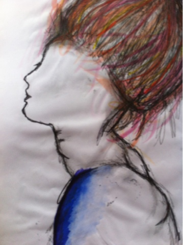
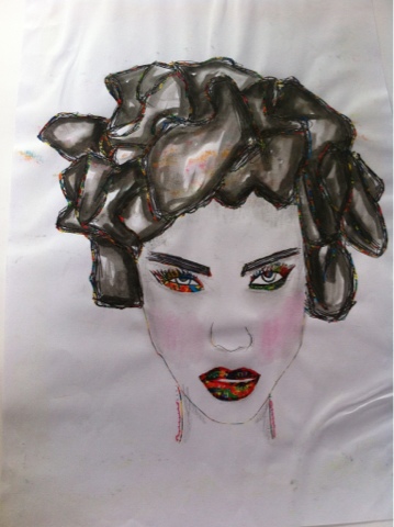
In this project I have used a number of different formal elements. I have used line to show the flow of movement with in my illustrations. I created this element using a biro pen because it highlights shapes and gives the illustrations free form. Another formal element I have used is colour. I used colour to create dynamic, loud illustrations so they are vibrant and exciting. I used watercolours to show this element because not only can you get bold colour but you can create tone usin this material. Using watercolour shows the contrast between light and shadow giving the illustrations a 3 dimensional depth. The main element I have used is composition. Using composition helped me to place different areas of the illustration which helped with my decision making. The composition of my illustrations were unbalanced so one side was heavier than the other. With the heavier side being dominant we are drawn to that area. 
Through out this project I think my strengths has been my artist research. As I looked at a variety of different fashion illustrators I hade a wide range to experiment with.  This helped with my decision making and the choice of the materials I was going to use. When first creating my final illustrations A problem occurred where they were too flat and busy. I overcame this problem by taking back a few steps and looking at my research. By doing that I rethought about the composition and the components going to be used. After doing that I came up with successful, crisp outcomes.
My strength here was my detirmination as I wanted to have a successful show. Even though I have annotated everything I think this area is the biggest weakness because I don't believe that I have annotated it thoroughly enough. From this I have learnt that annotation is equally important as the practical work so in future I am going to spend more time on the theoretical side. Setting up the exhibition and preparing for it went well because I had my illustrations create and printed in time so I had my work up quickly. 
From this project I have learnt that artist research is extremely important because it is the grounding of your projects and inspires your ideas. I have also learnt that experimenting with a wide variety of materials is helpful because you have a wide range of choice to develop from. While creating my illustrations my MAC based skills have improved a lot because I now know a broad range of techniques that I can use in the future. Another skill I have learnt is how to set up an exhibition. I believe that this went well because everyone worked as a team and had eachothers opinions to develop from. 
Overall I think my project has gone well because I have a strong body of research and development. I think it has gone well because I have problem solved to create successful and professional outcomes. I believe that my exhibition display was successful because it shows a development process on the boards so the public can understand where I got my ideas from. If I was going to do this project again I would think more into the model layer of my piece and play around with poses so I could have a more unique outcome. I would also use more pattern to create texture and give it depth. To develop from what I have produced I would play around with brighter colour palettes, textured patterns  and compositions. I am pleased with what I have produced for my FMP because Inhave kept developing further throughout this project. Even though I am happy with my exhibition and outcomes I would like to push my illustrations further because I believe they can be experimented with more. 

Thursday 13 June 2013

FMP-Greek Layering Graffiti Sheet

From researching Raphael Vicenzi's fashion illustration I was inspired by the layering, textured effect present in his designs. I liked the idea of layering because they did not look like flat 2 dimensional drawings because the layering of each component gave it a 3 dimensional depth. His illustrations were busy and loud because text and imagery were randomly placed making them unbalanced and quirky. As the idea of layering inspired me I decided to experiment with it on tracing paper to play around with composition and materials. 
The materials I used were pro-marker pen, biro and pencil. Using the pro-marker pen created a pop of colour on the page which draws us in, creating excitement. The biro pen highlights certain areas making them dominant. Also using a biro shows successful flows of movement the marks create as it has free form. Using the pencil created tone which shows the contrast between light and shadow giving the shapes a 3 dimensional depth. 
The layering effect on this sheet gives it an element of abstraction because it is representational. The use of tracing paper fades the text and makes it indefinite. The busy text is randomly ordered making it loud as there is a lot going on. Using tracing paper has also blending the text together creating textured depth.
I think this sheet has worked well because it shows an effective depth into layering and also plays around with different combinations of materials. The idea of layering is successful because this process can also be created using the MAC computers with the layered tool on Photoshop. By creating layers on the MAC I can easily play around with composition and remove stuff I do not want. For further development I am going to using this layering process in different media such as clay and graphics. I am going to do this to see which media is the most crisp and clean for my final outcomes. 

FMP- Raphael Vicenzi Critique


'You'll never be rich and famous' gives off the idea of putting someone down' as if they are not good enough or talented enough to be known or at the top. This statement brings you back to reality in an abrupt way by using the word 'never'. By using this word it makes it seem as if it is impossible and will not ever happen so you should just accept it. In the illustration it also says 'Forget about it', which supports the idea of it never happening. ' Forget about it' is used to say that there is no point in even thinking about it. It ruins the idea of dreams. Also these words used are abrupt and have a harsh manner to them. It is almost as if someone is talking down to you. The text used is American casual talk. It has a layer back impression as if it is not important. 
First glance the words 'Rich and Famous' stand out because thy are bold and striking because they are thick and blocky. Without reading the rest of the text we would not understand what the illustration is actually about. Therefore this makes the illustration misleading.
In the illustration bright, vibrant colours are bursting off the page which gives it an element of excitement. This could perceive the colourful experience of being famous and how busy the lifestyle is. Using these colours also make it misleading because we think of bright colours being happy, whereas this illustration is downgrading someone. 
Excitement is portrayed by the busy composition and the use of different materials. As the words and shapes are randomly placed this is still some sort of sophisticated order. This creates flowing lines to show movement. 
The text and imagery have been juxtaposed together to create layering. From this layering effect texture is created as certain areas overlap creating depth. Without each layer this illustration the composition would not be correct because it would unbalance everything. If we took away the small text the idea of this illustration could be dreams or celebrities. As the small typography is added it changed the whole mood of the illustration by making it abrupt and downgrading. The first layer of this illustration is the girl. We know this because every other component has been overlapped onto her. From her strong structured pose we immediately think that she is a model. We are questioned whether she is an actual model or acting as a model. The order of the layering could be the journey of her career in the model industry. The small typography could show the criticism she has had off people and by being the first layer it is almost as if she is trying to hide away. 
I like the idea of this illustration showing a journey of someones career because it gives it a narrative and shows development. From this illustration I am going to develop the idea of layering and experiment with different medias to see which combinations and compositions work best. Firstly I plan on using tracing paper to create designs onto then layering that over each other. This will also help me experiment with opacity. 

FMP Research- Andy Warhol


Likewise to Andy Warhol's prints mine dehumanising the person as it is not actually them, it is a print of them. This question the idea of how you see the print. In comparison the Andy Warhol's art mine has bright, bold colours which makes it dynamic and exciting. Also likewise to Andy Warhol's work there is a strong contrast between the hair and the background which draws us to the hair and makes it dominant. There is a pop of colour on the page which fits into the movement of 'Pop Art'. My work is also blocky and bold like Andy Warhol's which makes the print strong because of the powerful colour. 
In contrast to Andy Warhol's work I have created an outline of the person which highlights her and shows the movement in the shape and makers her stand out. In comparison I think Andy Warhol's is more successful as the edges are crisp because the colour is tightly compacted together. 
Likewise my illustration is balanced because there is a equal amount of colour and shape on each side. Andy Warhol's prints are close towards the face which make them dominant compared to the background. 
I don't think my outcome was very successful because it does not have the softness in the mark making that Andy Warhol has. If I had soft tones it would blend to create depth and make the piece look 3 dimensional. Even though Andy Warhol's work is dynamic and exhilarating I don't think I'll use his process for my illustration because they are too blocky and bold. If the bottom layer was bright and bold with colour is would become dominant and fade out all the other layers. To overcome this I could experiment with the opacity tool but I would prefer to have my bottom layer more subtle so it contrasts with the other layers. 

Wednesday 12 June 2013

FMP- Gabriel Moreno Research


Another illustrator I have researched I Gabriel Moreno. Gabriel Moreno blends illustration with print making to create intricate, detailed designs. His illustrations are organic as the lines are curvy and free form. The free movement of lines shows the sensual,delicate shapes flowing which liquefy the illustration . Gabriel Moreno's flowing work creates rainbow like shapes which burst with colour. In his work he uses layering with the lines to create tone. The tone is created by the patterned lines creating shadow and depth. This makes it look 3 dimensional. The mark making tangles and creates a mixture of different shapes and textures as they overlap. His designs are crisp and clean as the edges are overlapped and tightly compacted together. Even though there is freedom with in his mark making there is precision because there is formal order. He uses the human form so there had been a strong use of observation. Watercolour is present in some of his work because it draws is into certain areas and gives off a vibrant burst of excitement. His work is unbalanced which inclines us to draw our attention to certain areas. This makes certain areas of his work heavier and dominant. 
  Gabriel Moreno's work has inspired me to focus on the small details as well as the larger details to create a more crisp, professional outcome. Focusing on small details will work well for my illustration because I'm going to print them large scale, so by doing this you can see the delicate, intricate marks I produced . His work has inspire me to link different areas together through flow of movement within the lines. Also I like the idea of the illustration being unbalanced because it makes it loud and gives it formal order. 

Tuesday 11 June 2013

FMP- Sarah Moon Research

Sarah Moon's illustration are soft because there is no blocky, bold elements present. As is it soft it makes the illustration look delicate and subtle. The idea of it being subtle makes it less overpowering and calm. In her illustrations muddy colours are used which makes them look dull. If I was going to create an illustration using the same colour palette as Sarah Moon I would use tea staining because it would be successful as it wouldn't be bold and vibrant. The eyes in her work are dominant because they are bold and striking which draws us in. These piercing eyes have been created with tone which gives them a three dimensional depth and makes them realistic. The coloured behind the figure used for her illustrations is successful because it highlights the figure making it stand out from the background. 
I decided to look at Sarah Moon's illustrations because they are more subtle and calm compared to the other illustrators I have research. With Sarah Moon's work I think the most successful factor is her use of tone. The tone blends in the figure creating shadow and light, making it look life-like and gentle. Her work has inspired me to use lighter tones and gentler marks to create subtle layers.  I would develop her materials and methods by experimenting with chalk to have a free flowing composition because chalk is a material you don't have full control over. I'm going to use the subtleness of Sarah Moon's illustrations for my model layer because this effect will not fade any other layer and at the same time it is not dominant.  

FMP- Fourth Illustration

I created the first layer of the model on Illustrator. After doing that I realised that the model looked flat and traced like a cartoon. I overcame this problem by using colour to create tone which gave it depth and made the model look more realistic because her features were highlighted. Adding the colour also gave the grounded texture which I could experiment on top of. As the faded colours worked so well I added more to give the illustration grounding which created patterned textures. I added linear illustration of the Acropolis to show the flowing movement of the lines and also because it fits in with my theme of Athens. These illustrations contrast with the bold, large areas of colour. I adding shadow to the Acropolis drawings which highlighted them so they would not fade into the background as they are not as vibrant as the other components. The busy text is randomly ordered which gives it a child like playfulness yet sophistication as the marks have been put together to create a highly complexed layer. The striking shapes create distress because they are overlapped and tightly compacted together which creates a busy composition. The shapes and colours used in this piece give it an abstract element as they are representational and not definite objects.
Having my model large scale was not that successful because she looks to linear and traced ,so if I was going to relate this again I would draw her on a smaller scale so the lines are closely compacted together and she would not dominate the page. I think the mixture of different colours overlaid worked well because it creates a textured pattern and has a child like playfulness to it which makes it fun.
If I was going to develop this illustration further I would add more coloured tone to the model to make her look three dimensional and more realistic. I would also play around with different patterns and opacity levels to make this illustration more intriguing and have more depth.

FMP- Third Illustration

'Athens' has been repeated to emphasise what this illustration is about and where the ideas have come from. The text has been added in a scratchy manner as if the illustration has been attacked or carelessly used as a canvas. This supports the idea of graffiti being placed anywhere. The text looks like it has been applied harshly because the lines are messy with no formal order. 
From first glance the Acropolis illustration with the graffiti pattern on the top draws me in. This area is dominant because the layered textures create depth which makes it dynamic and stands out. The bright colours bursting off the page gives it an element of excitement. Excitement is also shown through the busy, loud composition and the variety of materials used. The dominant colours, orange and blue, contrast with each other making the illustration loud and bold. Words and shapes have been randomly placed but are still in a sophisticated order which creates flowing lines to show movement. The layering effect texture is created because areas overlap creating depth. This illustration is balanced out by the bold illustration at the bottom and the blocky colours at the top so neither side is heavier. There is a contrast with the subtle marking on the model and the dynamic, blocky shapes of colour which creates variety. The textured pattern blends into the hair creating tone and contrasts with the linear hair. The mark making is organic because it is curvy and free-form. 
This illustration is quirky because it is indefinite and unconventional. 
This is my favourite illustration because the contrast of the orange and the blue compliment each other and make the illustration look dynamic. Another reason I like this illustration is because the model is created with a variety of pattern and line which almost gives her an abstract element as it is representational. 

Sunday 9 June 2013

FMP-Cy Twombly Research Page

As I am going to have an element of abstraction in my illustrations I have decides to research Cy Twombly. Cy Twombly's mark making is harsh because it is scratchy and looks like it has been scribbled on the page. Having scribbled marks also makes it child like as this is how you would expect a young child to draw. Continuous like is used to show the flow of movement within his paintings. His work is free and random as the marks are loose and have no order. His work is untidy because it seems as if everything has been jumbled up. The harsh scratching makes his pieces powerful as it is bold with emotion. From first looking at Cy Twombly's work you would think it is an illusion because it isn't easily read. This way we are left to create our own ideas about his paintings. The shapes and colours present in his work give it an abstract element as they are representational and not definite objects. It looks as if he as attacked his paintings because of the harsh messy lines. The messiness makes it loose with no formal order. His busy mark making is randomly ordered. I think is work is quirky because it is indefinite and conventional. The simple mark making creates childlike playfulness yet sophistication. The marks have been created to make something highly complex.
I like the style of Cy Twombly's work because it is grungy and the harsh mark making makes it look dynamic and bold. Cy Twombly's work has inspired me to be more free with my mark making. From his work I'm going to develop the idea of using scratchy marks because even though it looks untidy it gives it a textured surface but also looks quite subtle. 

FMP- Experimenting with Print


From the graffiti I found down Bridgend Recreation centre I decided to look at the  flow of movement within the mark making. I did this to experiment with continuous line which made the graffiti look organic as it was free. Taking the idea of layering I created mono prints using 3 different colours and placed them on one another. By doing this it gave it texture because the lines mirrored each other also creating shadow. Using a range of different colours made it look like fireworks so the colours exploded off the page. This made the mono print look vibrant and dynamic as they are bold and exciting. The mono prints look abstract as the graffiti is no longer read as graffiti. I think this design could be used as a surface pattern or an all over print. I think these outcomes were successful because the graffiti has been developed into a exhilarating pattern. Also having the background white emphasises the colour as there is a strong contrast. I'm going to develop these prints by applying them on fabric and experiment with how they could be displayed on a garment.

FMP-Printing on Fabric


After creating a series of mono prints I developed them onto fabric. I did this because using fabric is relevant to fashion and it helped me decided whether or not to include drawing on fabric in my final illustration. Using the fabric pen worked well because the colours were bright and visible making the pattern powerful and eye catching. The problem with the fabric pen it looked to flat and needed an element of tone to give it depth. I think that using fabric pen has worked well because the marks are dominant. The problem I have with the fabric pen design is that the black areas are too bold and overpower the actual print. If I was going to create this again I would choose a more subtle colour to show shadow so it would not be so overwhelming. Creating my mono print on fabric has not worked well because the mark making is faded and looks dull. Even though some areas are clear it is not bold enough for my illustrations. Using mono print on fabric has not worked well because the fabric moves a lot when you apply the ink because it is stretchy. If I was going to do this again I would think about stretching the fabric out then applying to ink so I would have a more definite print. From these experiments I have decided that I am not going to use fabric because the outcomes are not crisp and clean to a professional standard. 

FMP- Experimenting with different Media


For my FMP I am using mix media to show the different textures created when all the layers are flattened. In effect to this I decided to create a4 sheets of mix media to see what materials worked best together and to experiment with composition.
I experimented with print press, creating the name of my title in bold. I did this in black so the typography would stand out and be quite dominant on the page. I found this printing successful because it was blocky and bold, which makes it dynamic, almost as if it is jumping out of that page at you. I created more than one print because it looked unbalance. I like the idea of having a blocky print because it contrasts with the thin linear lines. This process could be successful for my final illustrations but I am going to consider making the text smaller so it doesn't dominate the page as much.
Another material I have experimented with is chalk. I used chalk as it is a messy material which gives it an element of freedom because you don't have total control over the mark making. I used chalk to show a contrast between this material and a finer one. Using chalk creates tone which gives it depth and makes it look 3 dimensional. It also adds a stone like texture.
Using biro created a fine line which contrasts between the thicker materials used. I used biro to highlight certain areas and make them more vibrant. By using biro it shows the flow of movement within the shapes and makes it look organic.
Another material I used was stitch. I decided to use stitching as it is more relevant to fashion and garment making. Using the stitch highlight the area as it was a higher layer than everything else. This created texture and gave it a 3 dimensional depth. I think this worked well because it contrasts with the other flat material I have used.
Watercolour is present in both designs. Using water colour made my designs vibrant and bold because the colours are bright and exciting. I enjoyed using watercolour because I could also create tone to show contrast between shadow and light. I also used it to highlight certain components which also created negative space. Using negative space left a memory or the shape as if it had disappeared or it was a dream.
I think these experimenting sheets have worked well because they have a wide variety of different materials which all work well to create different layers. To develop from this I'm going to consider the composition of each element and which work best together. Also I'm going to consider creating my layers in Photoshop to emphasise the layered effect which I want to achieve.  

FMP- Experimenting with different materials on own illustrations and drawings

For my first layer of my illustrations I am planning on using a model to show that it's a fashion illustration and to relate it to my artist research. As I am using a variety of materials I would like the same to be done for my model. To help me decide which materials work best together I have experimented with variety of combinations.
From my artist research I found that Raphael Vicenzi uses photography in his illustrations. This has inspired me to do the same as it gives the illustration a different dimension and creates variety for each illustration. Even though the quality of the photograph I took isn't great this will not affect my outcome as it is only the first layer and I am developing other components on top. As the photograph was a bit gnarly I decided to have a biro outline to highlight the shapes . I think this has worked well because it doesn't look like a photograph anymore. It looks more like a graphic illustration because all the linear movement has been highlighted. It almost looks like a cartoon. 

I have created another design using block colour and line on Photoshop. Doing this has made my illustration bold and dynamic because it looks clean and crisp. Adding the black linear lines have helped highlight the flow of movement with in the hair and shows freedom with in the mark making. The problem that I may face with this is the block colour being too dominant and overpowering. If I did this as my bottom layer I think it would dominate the illustration and fade the other layers. Also with my illustrations I do not want the main focus to be the model because every layer plays a part in the composition. Even though the block colour for this layer has not worked  I am still going to experiment with the blocking but in smaller areas and also use the opacity tool.
On another illustration I experimented using pencil on a graphic drawing. The graphic drawing I created worked well because the lines where accurate and highlighted the model. Even though that was successful I think it looked to traced and flat.Then I decided to add tone with a pencil to make it look realistic. By adding tone with a pencil it gave it a 3 dimensional depth and the illustration was not as flat as before. Even though adding the pencil worked well I prefer colour because it is more exciting and vibrant which is what I want my illustrations to be.

Then I created an illustration with pencil and water colour. Using the pencil made it look less traced than the other which made it look more realistic. I then added watercolour paint to create tone with colour. This worked well because the colour showed a contrast between light and shadow which made it look realistic. The problem I faces with this design was the pencil smudging when I added the watercolour. This made the illustration look messy and the lines were not crisp. I do not think I will use this material combination as my outcome is not clean and looks unprofessional.
I created another illustration using chalk pastels. I did this because the vibrant colours burst of the page which makes it eye catching and intriguing. Although the colourful pastels capture the element of excitement they are messy and I didn't have much control of the mark making. I think was unsuccessful because the material I used was untidy and do not give a crisp finish. As it is not clean and crisp it looks unprofessional so I am not going to use this material.
I created my final illustration sample on illustrator. This works well because even though it has been traced I used a thinner brush so the strokes were not overpowering. The mark making is subtle and looks crisp. I then contrasted the computer drawing with a hand drawn material. The watercolour used creates a contrast with tones which works well because it looks 3 dimensional and realistic. Also the exploding colour is bursts of exhilaration on the page. I am going to consider using this combination of materials because they compliment each other as they both are not heavy.


Firstly I experimented using mix media on my previous Photshop illustration. With these outcomes I found that using stitch was successful because it created a textured layer and gave it depth. Also I found stitch relevant to fashion as it is used in garment making. 
Another process I found successful was watercolour. By using watercolour I create tone given it a 3 dimensional depth. Also the colour used creates excitement and playfulness. 
Using pencil did not work well because it was not powerful enough and looked dull. Even though it create the contrast between light and shadow well it was too faded and would create messy smudges.

Saturday 8 June 2013

Journey- Colour Slip Process

As I am looking at signs for my project I created a panel using the colours slip process to shows the positive and negative of a shapes of signs. 
By creating negative shapes it gives an idea of the shape being a memory or a dream, as if it isn't there anymore. Also it creates a shadow which give it a 3 dimensional depth. 
I used press stamps and edges of the clay knife to create pattern. This create texture and balanced out the composition. While making this slab I found it difficult to stop the slip running under the paper. I solved this problem by dampening the paper before I placed it on the clay. Another problem I found was  the thin clay. As the clay was so thin I had to be careful how deep I made my mark otherwise it would break. I overcame this by pressing gently the shape or textured I wanted.
I think this process worked well for me because I was careful on how I applied the slip over the paper so that it didn't run.Also I think the composition works well because everything is balanced out. For further development I'm going to experiment with underglaze pens so that I can create bold lines which highlight certain areas.

Homage to Books Pewter Process


Evaluation of Making Process
For our making of this process we were given the task to choose a letter which related to our Homage project. We had to come up with 10 or more Calligraphy designs four our outcomes. We then had to choose the best design and create it using clay. We used clay because we had a lot more freedom with the shape and we could play around with the pattern. Doing this was quite difficult because the pieces we were going to create were quite small so we had to take care when making and to di it neatly, and have full concentration. I think this worked well because my shape was accurate and looked how I wanted it to. We then had to leave it to dry and harden so it would be suitable and substantial to pour the rubber mould onto. Then I used a pre-made wooden box to place the letter into. Then using a hand saw we creates a funnel so te pewter could be poured through. We had to create this at the highest point of the clay letter so that all the area would be filled and there wouldn't be any air gaps. This process worked well for me because all the area around the letter was correctly filled and once removing the rubber I had the shape I wanted. Once we were ready we mixed up the rubber with the hardener so the latex would set to form our mould. We did this by the ratio of 99% silicon and 1% hardener. While adding the rubber mixture we had to take care because it would expand. Also you are not able to get it off your clothing. Once we had poured enough we left it to harden for a week. We pealed our hardened rubber mould away from our clay template in the box. The next step was to create a way for the air to escape so it wouldn't affect our final outcome. We did this by carving in thin deep lines which weren't large enough for the pewter to seep through. We started heating up the pewter on a portable hob which liquefied it. The pewter was extremely hot so we made sure to wear protection like gloves and glasses. We carefully moved the unwanted layer of impurities in the pewter. On the mould there would be unwanted edges present and would affect where the pewter would go. We removed these by using a scalpel and gently carve away at them. We used wood to stop the pewter from leaking out to give the shape a flat surface. We wrapped wire around it so that the mould and wood were firmly held together. Then we placed it into the vice to give it extra hold so it wouldn't move anywhere. Next we poured it into our moulds which were pressed against the wood. We did this using safety gloves so that if we got it on our hand it wouldn't burn through our skin. We used safety goggles to protect our eyes just encase any got in. As the pewter was hot we left it to cool for a few minutes, to prevent burning ourselves, then removed the mould. Lastly we had to sand wet and dry paper and polish to get the pewter looking professional and neat.

My outcome for this project could have been better because I didn't sand down the pewter edges and face enough to make it look clean. If I did this my outcome would have been more successful because it would have looked professional. If I was going to do this again I would take more time to perfect my work. Also I would have chosen to create a bigger design so it wouldn't be as fiddly to make.

Homage to books Experimenting with different Typography


I decided to look at typography in my Homage project because text is what makes a books and I wanted to experiment with different styles and fonts.  Firstly I looked at created negative space with text. This worked well because t create a shadow and outline of the shape, almost as of the letter become a memory of it's own self. To develop this I would create screen prints using this technique by creating it on the computer and transferring it to acetate. The would give it an element of graphics while compared to the cut out it would be blocky and bold, which would make it vibrant. In comparison to the negative space I create text cutting out the actual letters. In contrast to the negative cut it shows a difference with layering as this one looks 3 dimensional because it is sticking out. Like wise I could also create a press mould using the cut outs to create a texture piece. Using it as a press mould would give it depth and make it look 3 dimensional. 
In contrast to the other typography I looked at modern writing, graffiti. I looked at graffiti because it is a contrast to calligraphy has more order and abrupt lines .Graffiti writing is soft as it bubbles shaped with round edges. I find this writing successful as it is exciting and unique. What intrigues me with graffiti is that it is questioned whether it is art or crime. To develop graffiti writing I am going to explore around my area to see if I can find actual graffiti writing and create fabric prints focusing on colour palettes and styles of graffiti. 

Homage to Books Plaster Mould Process


As my project is called Homage to Books I decided to create a plaster mould using books to show the imprint and textures present. I lined the books up so it looked like they were on a shelf. This made them look neat and clean, almost like they would be placed In a library. When create the plaster mould I didn't make my clay walls strong enough so they collapsed and the plaster leaked. I solved this problem by quickly adding more clay to the corners of the mould so it would be strong enough to hold the plaster. After I peeled away the mould from the dried plaster I had some inaccurate edges. To over come this I cut them off on the band saw. This process worked well because my press mould had a variety of layers and textures which made it look 3 dimensional and gave it depth. To improve on this process I would be more careful when pressing the books into the clay because it slipped and didn't come out straight. To develop this outcome I would create smaller pieces uses different areas of the books to experiment with texture. I would also create more plaster moulds and line them up so it would look like a shelf.

Homage to Books Rolling Process


For my project I decided to experiment with the rolling process as I had never used it before and wanted to add an element of ceramics in my work to show variety. While doing this process I found it awkward to roll the clay around the tube because it would either break or the size would be inaccurate. To overcome this I made sure I measured the tube against the clay to get the correct size and I rolled the clay out to a medium thickness using the guides to help me. I enjoyed doing this process because there wasn't a lot of refinement to do as the edges of the clay were flat because it is a cylinder. This process worked well because my outcomes were successful as I concert rated on getting the shape and size accurate for my tubes. Using the press stamps works well because they created clean and crisp letters and didn't dismantle the shape. To develop this further I word experiment with different sizes to have a variety of scale.

Homage to Books Artist Research Rob Ryan


Rob Ryan's work show a world of beauty  with people and love. In his creation the background is always white and the people in colour which pales the composition for the main focus to be the people. He does this to emphasise the love and emotion of the people because their love for each other is the only thing that matters in his work. In his creations he often has a border which is perceived as a protective bubble for the people. We get the idea that it's safe because of the fixed, bolder lines used to create it which makes it look powerful. With Rob Ryan's work most people have or will have these experience which relates to the public. His work is created on large scale which is powerful and it overwhelms us with emotion. This process he uses is fiddly and time consuming because he has intricate detail to show the textures of the surrounding areas and also the shadow.  Doing this creates depth.

From looking at Rob Ryan's work I tried to create my own design using his process. This process didn't work well because it was difficult to create intricate detail on small scale. If I was going to do this again I would plan my outcome first and decide which areas I was going to carve out. If I created a successful design of this I would develop it to make a print so there would be texture and reflection.
In comparison to Rob Ryan's work mine isn't as meaningful as his because everyone can relate to his where as mine was from book. My work was unsuccessful because I drew the shapes out I wanted to carve where as Rob Ryan does his work free hand. With Rob Ryan's work he uses the contrast of white and colour to create emotion and tone. In my work I have just used a plain sheet of paper. If I was going to do this again I would use a more vibrant colour sheet so that it would be dynamic and clear.

Homage to Books Artist Research Bronia Swayer

From looking at artist who use the actual book in their work I found Bronia Swayer. Bronia Swayer  takes the pages from the book and moulds them into different sculptures and uses them to print. By doing this she creates textured patterns and prints.


From looking at her work the pages in the book look oriental as they look free and loose. The path of the pages show flowing movement as they expand off in all directions, liquefying the pages. The folding of the pages creates a layered effect which gives it depth. It also creates a contrast between light and shadow as we see the corners and the light surface. In effect to this it her work looks 3 dimensional. All her work is flowing and bursting out from the centre which make it exciting, as if it's exploding. Bronia Swayer's work has inspired me to use the book as a material and create something from it. She has inspired me to recycle the book into something useful.


From looking at Bronia Swayer's work I decided to not create pieces with the book itself but to create prints using the technique of her page sculpting. I did this to experiment with shape and pattern for further developments.In comparison to Bronia Swayer's work mine is flat and doesn't have a definite shape because of the thinness of the pages. Compared to Bronia Swayer's work mine isn't as detail and crisp as her because it singularly sculpt each page as that would be very time consuming in the space I had. Also if I did that the printing wouldn't be as effective because the pages would be too delicate to print with an would be destroyed. I think my print has worked well because I have create a varied pattern using the same process as Bronia Swayer, but developed it further. For further development I could print this design onto fabric as an all over print or create different shapes with pages to get a different type of pattern. I found this process quite difficult because the pages were so delicate which caused them to easily bend. I don't think I'll do this process again because it is fiddly and difficult to get the right shape you want.

Journey- Critique on The Wizard of Oz

The Wizard of Oz is not just a child's story or a journey to return home, it's a journey about discovering who you are as a person.
The yellow brick road represents a lead to success or happiness as we relate yellow to happiness. In this film we see Dorothy trying to find her way home which shows that her happy place is at home with her family. Throughout this journey we see that she realises 'There's no place like home', and she learns to be grateful for what she has. Before this journey we see that she was bored of her life as everything was in black and white. As everything was in black and white we see that her life was dull and she wished for excitement. By singing over the rainbow this shows us that she's dreaming of a better place, somewhere fun and full of adventure which is represented by all the colours in the rainbow. 
Throughout her journey we see her discover friendship and that she isn't the only one looking for something. She meets the scarecrow who is in need of a brain because he doesn't know what to do, on the other hand he takes pride in being a scarecrow but gets upset when he is unable to scare away the crows. She also meets the tin man who is in need of a heart. By being made out of tin it shows us that he's cold and stiff with feeling. When she first meets him he couldn't move because he was rusted which shows us it's been a long time since he's ever felt. Maybe he was hurting. Also she meets the cowardly lion. This is ironic as lions are supposed I be strong and powerful. We see that the characters are discuses for everyday common fears in humans. These fear have been portrayed in a child like manner so it makes it more playful. It shows us that even the bravest person in the world has insecurities but with friendship you can get by. 
In the end they all find that one thing they wanted which shows us that anything is possible if you are willing to fight for it.
Towards the end Dorothy repeats 'Theres no place like home', which shows us her realisation that she took what she had for granted and regrets it. She repeats the quote to show how sorry she is. 

Journey- A Compare and Contrast between my journey and 'The YellowBrick Road'

My journey and the 'Wizard of Oz' journey are both literal as it's a journey to get to a certain destination. The difference is mine is real-life and ' The Yellow Brick Road' is a fairy tale, made up with hidden meanings.
The purpose of the journeys were discovery. My journey was discovering primary research for my chosen topics, which helped inspire my work. In contrast ' The Yellow Brick Road' was a journey of self discovery and finding out what you are like as a person. Also it was a journey of growing up.
Both journeys are based on topics and have different elements to them. Signs and colour were the topic of my journey, which are literal things you can see, where as 'The Yellow Brick Road' journey was more about emotion. This shows us that it had deeper meaning and hidden messages. The topics present were friendship, childhood, bravery and courage. All these topics come from living things and not objects, where as objects was what I was focusing on. Although signs and colours show emotions as they represent different things. 
Another similarity is that they are both representational as signs represent certain actions and 'The Yellow Brick Road' characters represent different in  securities. Over all both journeys are about learning and discovery.

Journey- Signs


For my Journey project I have been given the task to choose two topics. For one of my topics I have decided to choose sign because I can experiment with the bold fixed shapes and vibrant colour palette. As I'm looking at signs I have found Celt Abraham who uses signs in his work. In contrast to the meaning of signs he makes them humorous by adding small drawings on the signs. By doing this he takes away the actual meaning and purpose of a sign and it isn't a serious indication anymore. By doing this he creates playful harmless designs, making the area look risk free. From Celt Abraham's work I have been inspired to not use the sign literally but develop and turn it into something else.


 These were the signs I found on my journey. Signs have block, bright colours present on the which makes them vibrant and eye catching to the public. Text is capitalised to show the importance of the message and to emphasise what action needs to be done. In contrast to Celt Abraham's work these signs give off a serious atmosphere as everything is bold and outstanding, where as Celt Abraham turns it into a joke and adds humour to them. There is also a contrast of line with in his work and actual signs. Celt Abrahams work is not as bold as the actual sign itself. This could show that his drawing is harmless and also not to do the action which he has drawn .

After doing my primary and secondary research I was given the task to produce 4 A2 sheets. I decided to have a variety of materials to show experimentation. 
On the sheet I created signs using bright colour ink but making it linear. By making it linear it shows the flow of movement and simplifies the sign. From creating a linear effect all the simple shapes have become dominate which is useful as I can develop these shapes further. If I was going to develop this further I would taking it into ceramics and play around with the size and scale. 
On one I created I used black ink to show the dominate lines and to show tone. By using black it shows the contrast between shadow and light. I also used pencil for shading to give it depth and make it look 3 dimensional.
Comparing my work I think that the ones with colour present work best because I have used the colour to create tone and also to make it vibrant. By using colour is makes it dynamic and exciting.
In comparison to Celt Abrahams work my  designs have the simplicity that his has because of the simple shapes I have use. In contrast his simplicity is with the big impact from the small drawings. They both create an element of uncertainty because they are not read as actual signs anymore. They are read as art.