
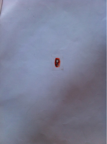
For my object project I decided to create a tiny thumb print and create an iPod from it. This print is minimalistic because it is simple and it dominates the page. I created this to show that the fewest elements can make the maximum effect. I uses the colour orange because it has a strong contrast between white which makes it vibrant. Having a white back and a burst of orange in the middle makes it exciting because something so small can be loud.I don't think this worked well because the thumb print isn't crisp so it look untidy and unprofessional. Also it being a thumb print doesn't show the harsh edges of an iPod. If I was going to do this again I would apply more ink to my thumb so that the shape would be bolder and wouldn't be as faded. This would make the print dynamic as the colour would be bursting off the page.


In contrast to my work Kazimir Malevich's work has crisp, clean lines which make it look professional. His work is graphic base because the shapes are blocky and bold. In contrast mine is print making and is gnarly. When Kazimir creates his pieces he doesn't create them to be he objects where as mine was made into an iPod. Similarly they are both what you see, is what you see and they have no hidden meaning to them.
No comments:
Post a Comment