
From my artist research I found that Raphael Vicenzi uses photography in his illustrations. This has inspired me to do the same as it gives the illustration a different dimension and creates variety for each illustration. Even though the quality of the photograph I took isn't great this will not affect my outcome as it is only the first layer and I am developing other components on top. As the photograph was a bit gnarly I decided to have a biro outline to highlight the shapes . I think this has worked well because it doesn't look like a photograph anymore. It looks more like a graphic illustration because all the linear movement has been highlighted. It almost looks like a cartoon.
I have created another design using block colour and line on Photoshop. Doing this has made my illustration bold and dynamic because it looks clean and crisp. Adding the black linear lines have helped highlight the flow of movement with in the hair and shows freedom with in the mark making. The problem that I may face with this is the block colour being too dominant and overpowering. If I did this as my bottom layer I think it would dominate the illustration and fade the other layers. Also with my illustrations I do not want the main focus to be the model because every layer plays a part in the composition. Even though the block colour for this layer has not worked I am still going to experiment with the blocking but in smaller areas and also use the opacity tool.


Firstly I experimented using mix media on my previous Photshop illustration. With these outcomes I found that using stitch was successful because it created a textured layer and gave it depth. Also I found stitch relevant to fashion as it is used in garment making.
On another illustration I experimented using pencil on a graphic drawing. The graphic drawing I created worked well because the lines where accurate and highlighted the model. Even though that was successful I think it looked to traced and flat.Then I decided to add tone with a pencil to make it look realistic. By adding tone with a pencil it gave it a 3 dimensional depth and the illustration was not as flat as before. Even though adding the pencil worked well I prefer colour because it is more exciting and vibrant which is what I want my illustrations to be.
Then I created an illustration with pencil and water colour. Using the pencil made it look less traced than the other which made it look more realistic. I then added watercolour paint to create tone with colour. This worked well because the colour showed a contrast between light and shadow which made it look realistic. The problem I faces with this design was the pencil smudging when I added the watercolour. This made the illustration look messy and the lines were not crisp. I do not think I will use this material combination as my outcome is not clean and looks unprofessional.
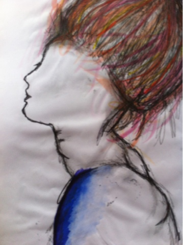
I created another illustration using chalk pastels. I did this because the vibrant colours burst of the page which makes it eye catching and intriguing. Although the colourful pastels capture the element of excitement they are messy and I didn't have much control of the mark making. I think was unsuccessful because the material I used was untidy and do not give a crisp finish. As it is not clean and crisp it looks unprofessional so I am not going to use this material.
I created my final illustration sample on illustrator. This works well because even though it has been traced I used a thinner brush so the strokes were not overpowering. The mark making is subtle and looks crisp. I then contrasted the computer drawing with a hand drawn material. The watercolour used creates a contrast with tones which works well because it looks 3 dimensional and realistic. Also the exploding colour is bursts of exhilaration on the page. I am going to consider using this combination of materials because they compliment each other as they both are not heavy.


Firstly I experimented using mix media on my previous Photshop illustration. With these outcomes I found that using stitch was successful because it created a textured layer and gave it depth. Also I found stitch relevant to fashion as it is used in garment making.
Another process I found successful was watercolour. By using watercolour I create tone given it a 3 dimensional depth. Also the colour used creates excitement and playfulness.
Using pencil did not work well because it was not powerful enough and looked dull. Even though it create the contrast between light and shadow well it was too faded and would create messy smudges.


No comments:
Post a Comment